Traild is a B2B software company that helps finance teams automate accounts payable processes and reduce risk. We partnered with the team to develop a modern brand identity that simplifies complexity, strengthens market positioning and creates a confident, scalable presence across every touchpoint.



Traild's existing identity lacked the clarity and consistency expected of a modern B2B software company. The brand needed to communicate automation, financial control and risk protection while working seamlessly across digital platforms, the website, sales presentations and investor decks. The project called for a considered software brand identity design approach that would modernise Traild and elevate market perception.

The new identity combines trust with innovation, using a clean and approachable visual language that will resonate with finance professionals looking for greater efficiency, automation and confidence in their workflows.
The redesign gives Traild a clearer market position and a more confident, professional presence that reflects the quality of their software. With a cohesive identity applied consistently across digital platforms, sales materials and internal communications, the brand is better equipped to build recognition, strengthen credibility and support future growth as an innovative B2B company.

"As part of our brand evolution journey, we invited several agencies to share mockups and directional concepts. Creative Caterpillar stood out in both their output and way their team demonstrated an impressive ability to deeply understand Traild. Throughout the process, they were incredibly collaborative, thoughtful, and responsive. They understood the brief clearly and balanced creative vision with the needs of multiple stakeholders seamlessly.
The final product is something we're really happy with. The brand assets they delivered needed minimal feedback and perfectly reflect the new direction we were aiming for. The quality of work, attention to detail, and overall creative execution have been top-tier. We wouldn’t hesitate to recommend Creative Caterpillar to other companies looking for a strategic and design-savvy branding partner."
CAILLIE DUNNE — HEAD OF MARKETING

The paperclip symbol is a subtle nod to the brand name's origin story: the paper trail. Reimagined through a modern lens, it represents Traild's mission to transform manual, paper-based processes into a connected digital experience.
Formed from a single, continuous line, the symbol conveys seamless integration, intuitive automation and a clear path forward. Its flowing shape evokes the idea of keeping track, following a trail and bringing every step of the accounts payable process together in one streamlined system. By elevating a familiar object into a distinctive brand asset, the identity tells Traild's story in a way that is both symbolic and instantly recognisable.

Derived from the core brand symbol, the Traild graphic system expands the identity beyond the logo. The enlarged paperclip evolves into a series of fluid lines and connected dots that create a flexible visual language, bringing consistency, movement and a sense of seamless integration across every touchpoint.


A significant part of the project focused on creating a presentation system that could match the strength of the new identity. The investor and sales deck templates were crafted to be visually engaging, highly functional and simple to update, empowering the Traild team to deliver compelling presentations with ease.


The comprehensive brand manual was created not only to define the identity, but to enable its successful implementation. It became the blueprint for Traild's new website, providing their design team with a complete visual system of brand assets, graphic elements, icons, styling principles and application guidelines. Although we were not responsible for the website design, the finished result demonstrates the flexibility and scalability of the identity across digital touchpoints.


A carefully considered colour and typography system was developed to ensure consistency across every touchpoint. The primary palette was extended through tints, shades and gradients, supported by detailed colour combination guidelines and typography rules that promote accessibility, optimal legibility and visual cohesion.


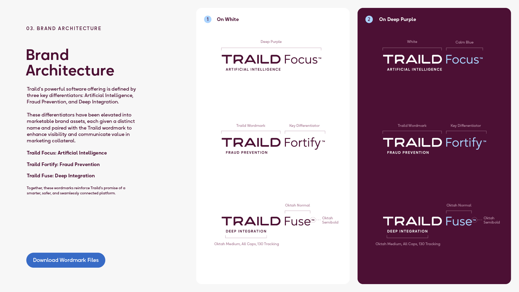
Every supporting brand element was thoughtfully developed, from the enlarged paperclip graphic and slogan lockups to photography, data visualisation and custom icons. Beyond the visual identity, we created a strategic brand architecture that elevated Traild's three core differentiators into distinctive, ownable brand assets.