Creative Caterpillar was approached by SKK Engineering to provide a creative solution to their marketing challenge: "How do we represent a 100% black women-owned industrial engineering company with both flair and strength in a male-dominated industry?"
We started our journey of discovery at the very beginning, learning about and highlighting what makes female leadership so special in today's competitive working environment.
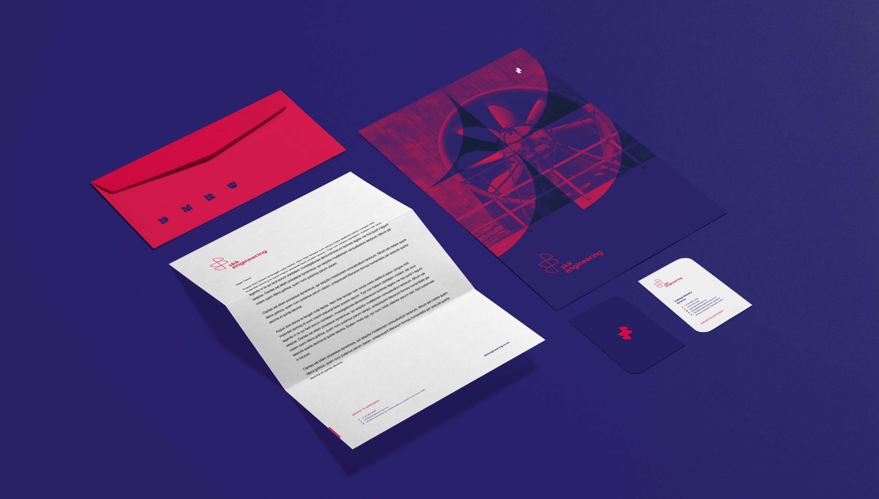
Logo to colour palette and iconography, our approach steered towards a single true north – create something never before seen in the industrial plant maintenance arena.
From a client perspective, it was important to create an innovative brand that pushes the boundaries of what an engineering firm is 'supposed' to look like.
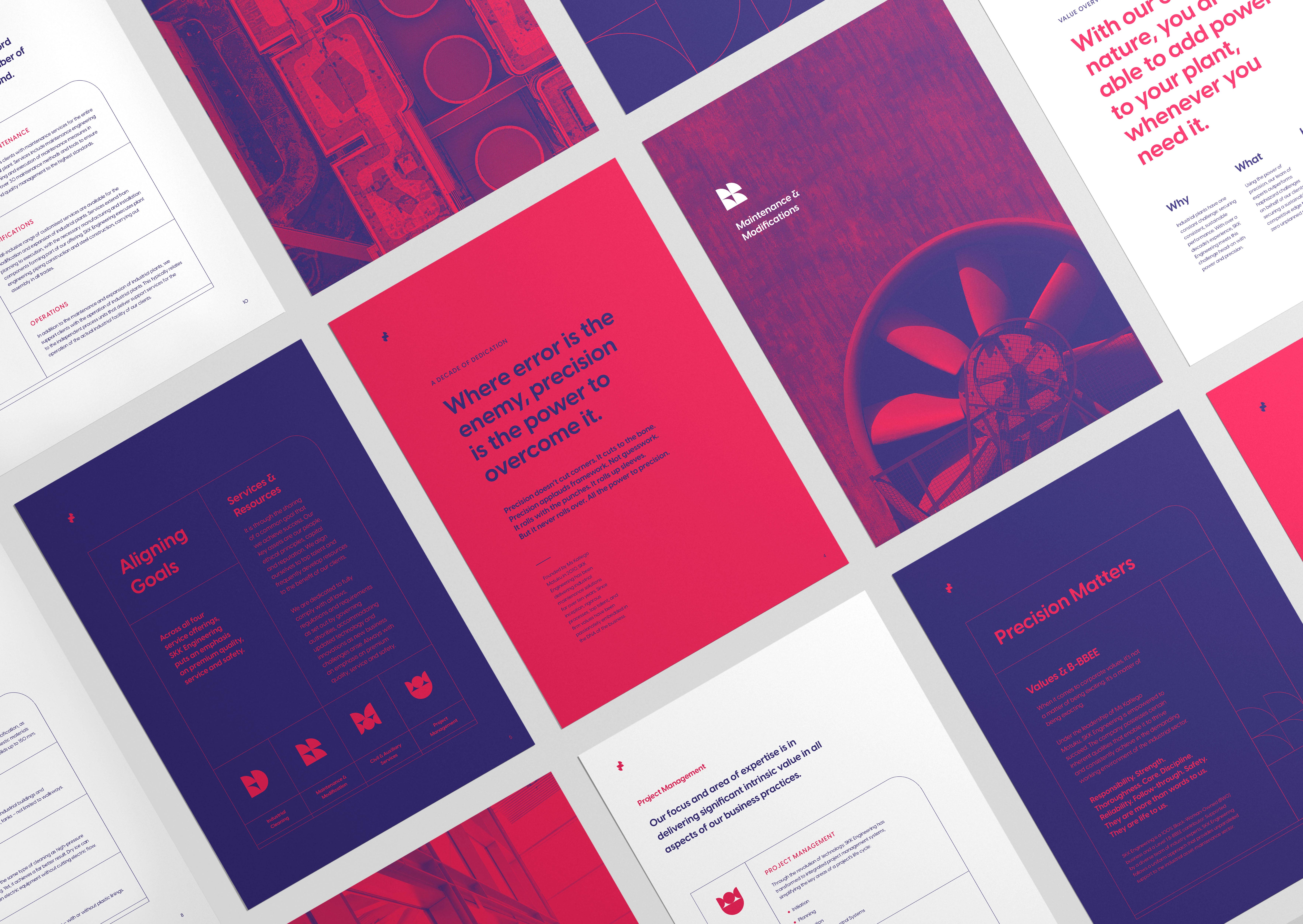
Precision is a virtue synonymous with female leadership. While physical power and strength should not go understated, women-led engineering firms embody methodical care, focus, intellect and discipline. Just like the body follows the mind, power follows precision. The strapline is a celebration of female strength and team power; of balance and organisational exactness. Therefore, all the power to precision.
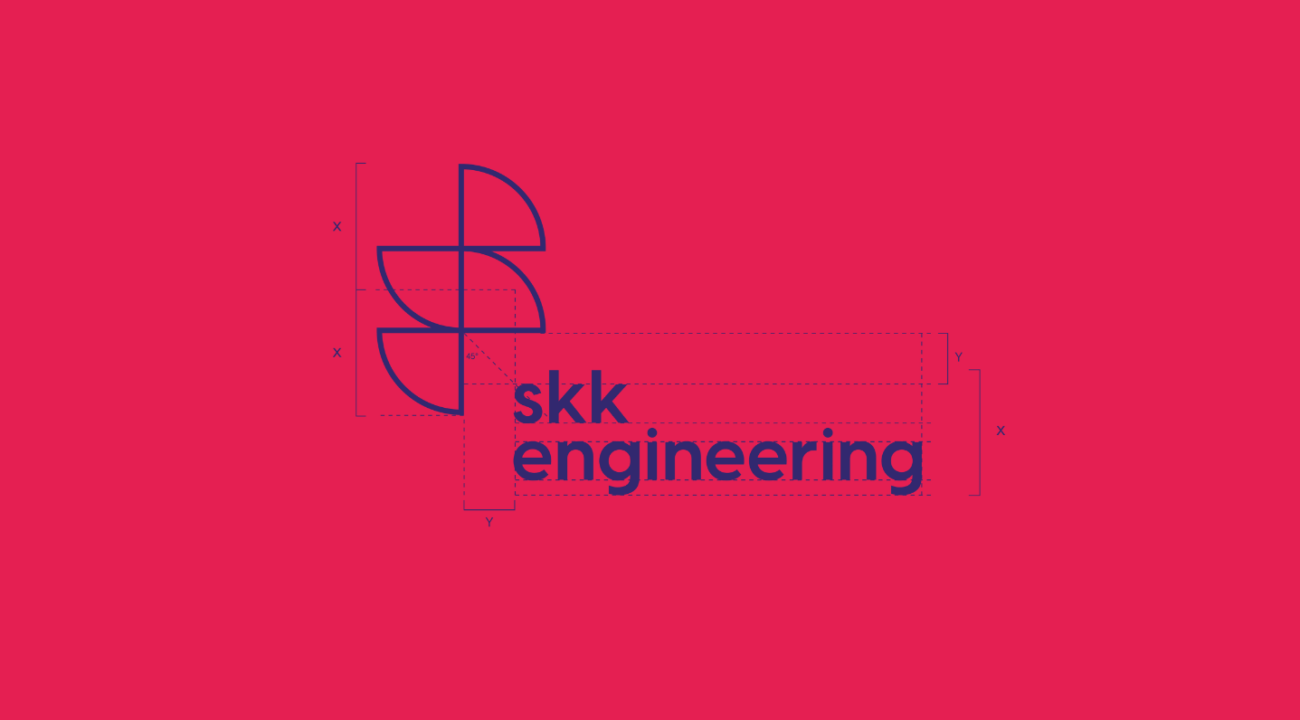
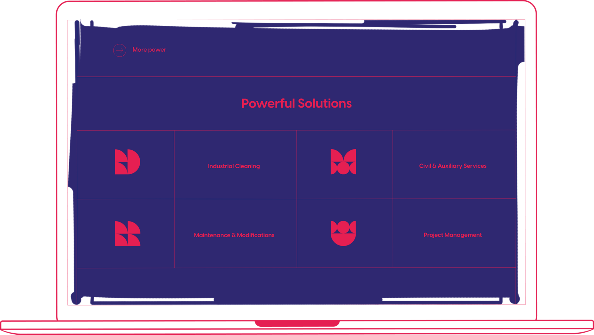
The logo and icon grid were inspired by the balance and precision of the Fibonacci Principle. The shapes were implemented according to ratios of 1:2 and 1:4.

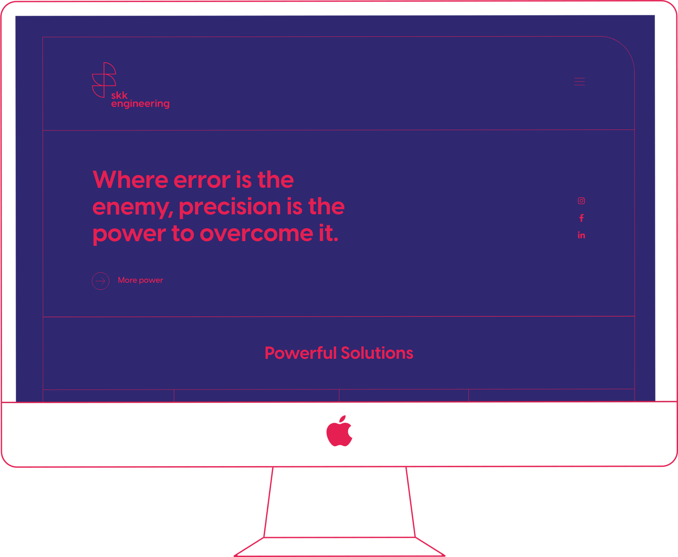


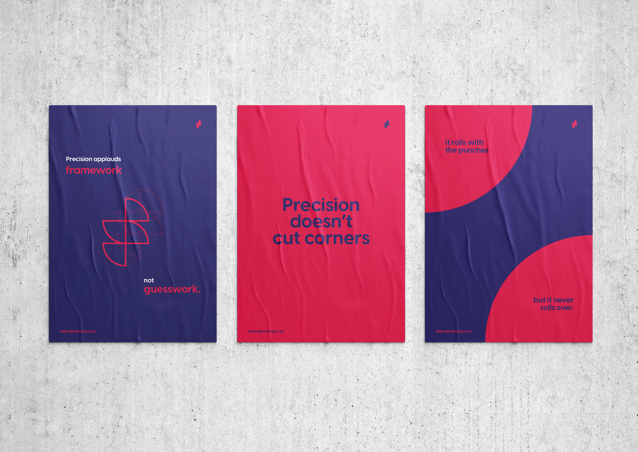
Across all communications created for the client, one message enjoys timeless prominence – precision is worth it. This key thought is backed by an array of specially-developed catchphrases which work to highlight the benefits of a woman-owned engineering firm.

