
Unlike a rebrand, where a name and positioning strategy is already in place, the MOOV Fuel project called for our full-service offering.
Our challenge was to reimagine the brand image entirely, starting with a name that would inspire clients for years to come.
The symbolic logo was inspired by the helix found in petrochemical compounds, and represents both an ‘M’ and perpetual motion.
To further the revolutionary approach to the brand the slogan ‘Like never before’ was developed.
After generating over 100 brand names, the selection was made and MOOV Fuel was born. The name was selected based on its simplicity, impactfulness, campaignability and relevance to the industry.


CORNEL VERMEULEN, MANAGING DIRECTOR


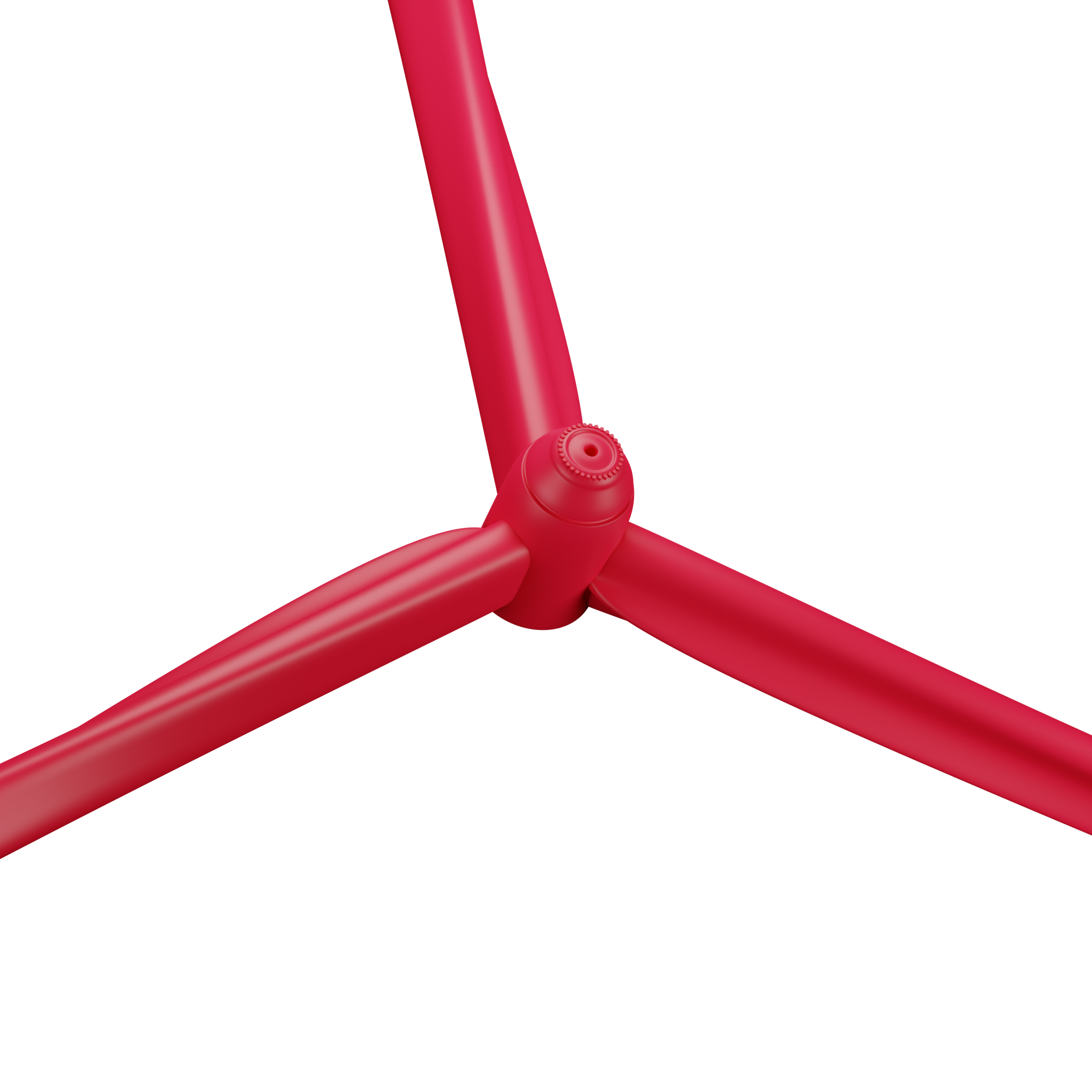
To help MOOV Fuel bring their brand to life in client presentations, we developed clean, modern 3D graphics in the brand’s colour palette to emphasises 'energy in motion'.


Social media campaign resulting in 460% sales growth over a 6 month period
During the COVID-19 pandemic, MOOV Fuel seized the opportunity to market their own range of sanitisers. The campaign we designed incorporated animation to attract attention and was implemented in their newsletter and across multiple social media platforms.